Typography for Children
By Paula Briggs
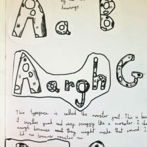
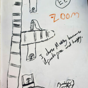
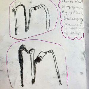
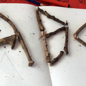
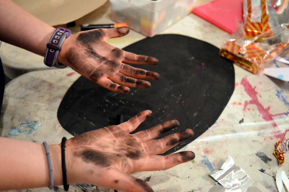
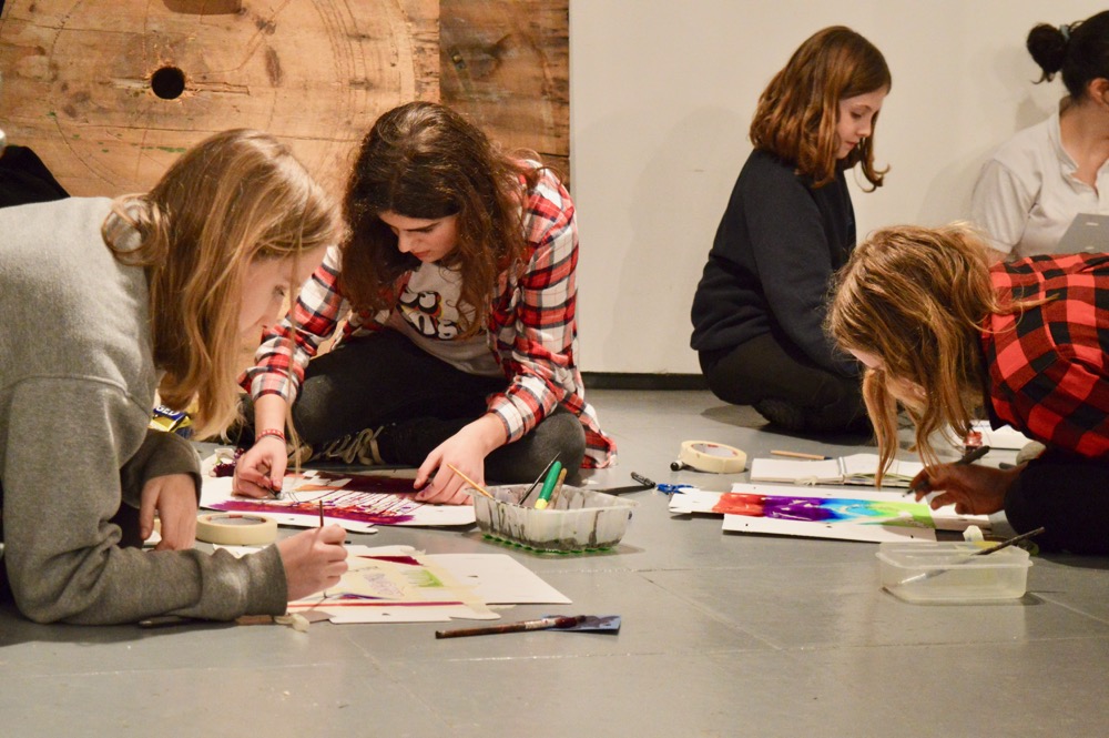
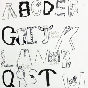
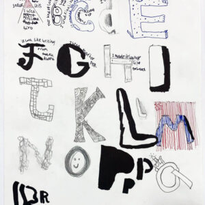
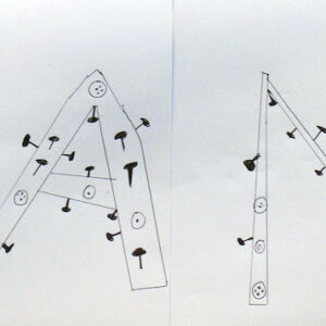
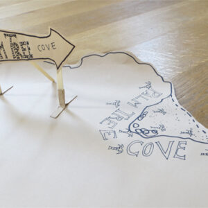
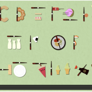
This resource introduces children to the art of typography. Exploring the creation of the letters of a tyepface in an intuitive and fun way, this hour long session encouraged primary-aged children (7,8, and 9 years) to think about the structure and design of letters as having personalities. Taking our starting point from observational drawing, children went on to develop graphic onomatopoeia.


Starting Points
We began the session by talking about some of the typefaces we are familiar with, and how easy it is using computers to experiment with different fonts for different purposes. I introduced the idea that someone somewhere had designed the typefaces, just like someone designs the cups and plates and cars we use, and that this is the art of typography.
Children had previously enjoyed the Thoughtful Mark Making exercise, which encourages diverse and intentional mark making. I wanted the children to bring some of this diversity of line to their typography, and would recommend using that exercise as a warm up before you try this session.
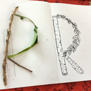
I wanted the children to begin with some observational drawing, not only to give them a starting point for their typography, but also to reinforce the relationship of drawing to design.
To access all content, I would like to join as…
AccessArt is a UK Charity and we believe everyone has the right to be creative. AccessArt provides inspiration to help us all reach our creative potential.
See the Resource Used in Schools...

Sharon Gale
January 9, 2019 @ 5:34 pm
What a superb way to introduce children to typography.
Emma H
March 28, 2023 @ 4:52 pm
Great resource, thank you! – (please note spelling error in first paragraph – onomatopoeia 🙂 )
Rachel
April 4, 2023 @ 9:33 am
Thanks Emma! All changed!
Kiri A
June 4, 2024 @ 1:51 am
This looks like a great resource! Im just wondering if others find it helpful to show their kids examples of things such as the photos above before embarking on it themselves, or if that tends to limit ideas?
Rachel
June 10, 2024 @ 9:59 am
Hi Kiri, thanks for your comment. It’s sometimes a challenge to strike the right balance between showing examples to direct the working, but not inadvertently offering something to copy! You’ll know your class best, but showing some examples of different (standard) font types might be a good starting point. The activity involves some observational drawing, from which they begin to design their own typography – so really, it’s their imagination and design that should be the focus. If you show them lots of examples of inventive typography it may steer things too far from their own approach. I hope this helps!