Drawing Inspired by Elements: Drawing Moving Water
Drawing Inspired by Elements consists of four drawing exercises which are designed to help you to look again at some of our most elemental drawing materials and find inspiration in the elemental qualities of earth, water, and fire.
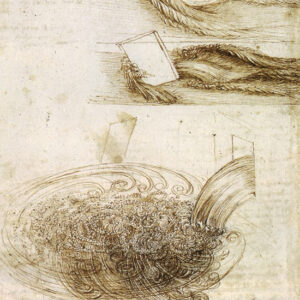
Inspired by the drawings of Leonardo da Vinci AccessArt ran a drawing workshop for younger children called “Drawing Pouring Water” during which children observed the movement of water to produce very eloquent and often controlled drawings. The workshop was run in a room without access to running water – so we relied on pouring water from jug to bowl – but in this resource we are going to widen our sources to “moving water”…

To access all content, I would like to join as…
AccessArt is a UK Charity and we believe everyone has the right to be creative. AccessArt provides inspiration to help us all reach our creative potential.

Glenis Goodman
September 23, 2012 @ 5:15 pm
Hi, here are some moving water drawings. This exercise was intriguing but also frustrating. I chose to run water into a washbasin quite fast, in order to cause a mass of bubbles. I tried this a few times before starting to draw and then began the drawing. Large areas of light and shade were discernible but I was surprised by how much the running water and bubbles obliterated the plughole and also how difficult it was to judge light on the bubbles which changed constantly. i was able to judge that the size of the bubbles became larger with distance from the water’s flow and also that the water landed in a U-shape. There was also a shadow on the water just where it emerged from the tap. I was using quite a lot of water so decided to record it and watch the video, stopping it a few times to get a better sense of light around the bubbles, which I then realised are only visible because they are ringed by light. In the first drawing, The tap doesn’t look quite right but the bubbles were great fun to draw! I used water-soluble graphite crayons and a wash in the first one, building up in layers, as suggested. I tried to bring out more white highlights at the end but this doesn’t work as well with graphite as with charcoal. In the second drawing, I used blue and green inks, applied with brushes, a home-made brush made with stiff string, and a bamboo pen in order to get a better sense of the mass of bubbles which break up the surface of the water and are present in a mound where they first form, spreading out as if rolling down a hillside from that point. It was not a great success. I left the tap out of the photo because I wanted to focus on the water but mainly because the tap in this drawing reminds me of a penguin! The water does appear disembodied…
Miranda Hobson
October 11, 2012 @ 10:51 pm
I admire the depth and scale of the bubbles you have achieved with the graphite. I can imagine the bubbles moving and floating away from the water stream.
Glenis Goodman
September 23, 2012 @ 5:19 pm
Second image – disembodied tap water.
Sheila Ceccarelli
September 23, 2012 @ 8:43 pm
I think you’ve done well Glenis with this very difficult subject matter – Definitely worth your perseverance! You can see how one study leads on to the next and how that in this exercise it really is about experimentation and trail and error to see what works – and how one successful mark informs the next etc.. I think you’ve achieved a lot in these drawings and it would really be worth carrying on- maybe even blowing up one small element of the drawing – like where the tap hits the water or the bubbles… Again, I can see the beginnings of a wonderful series here. I also like your use of colour and think there is a lot of scope for developing that as well – experimenting even more with brush strokes and line in colour (is that painting!?). I also really liked the way that you described making a movie of the tap running to make the drawing – all very exciting!
Benedicte Foo
September 23, 2012 @ 7:11 pm
Yipes, this was difficult! I looked at water in a steady stream from a tap into an empty washing up bowl. Very interesting to see a thin film form on the bottom with a hole where the water landed, then a build up of bubbles which got bigger and coalesced in the ‘hole’. I tried various sort of sectional approaches but all were very static so I then tried pouring water from a jus into a glass mixing bowl which was also intriguing with kind of rolls round the circumference. In the end I went back to the washing up bowl.
I tried aquarelle pencils but then wanted something stronger so augmented with felt tips and then tried a monochrome brush. Probably shouldn’t have changed subject and media so much!
BTW Glenis, I thought you captured the bubbles and the 3D sense pretty well! The stream of water IS odd because it’s sort of negative in the way it hits the standing water.
Benedicte
Glenis Goodman
September 24, 2012 @ 9:34 pm
Hi Benedikte, I like the balance of straight lines and the more random lines that depict moving water, as well as the different blackness of the lines – the focus is very much on the bubbles.
Miranda Hobson
October 11, 2012 @ 10:48 pm
Hi I like the graphic feel of this and your economy of line – I could see it developing into an even more minimal drawing, with flat areas of colour? – I like the two rings of bubbles they form a pattern.
nybrowne
June 19, 2013 @ 9:00 am
I really like this depiction of water, and I think you have captured perfectly the way that when the water hits the bottom of the sink it pushes out in an irregular and shifting circle. I like the bold lines.
Benedicte Foo
September 23, 2012 @ 7:15 pm
second subject–water from jug into bowl
Benedicte
Paula, do comment on whichever you’d prefer to, though the execution of this is rather crude I think
B
Sheila Ceccarelli
September 23, 2012 @ 8:48 pm
Hi Benedicte,
You’ve also done a good job here and I agree a very difficult subject matter – if not the hardest, certainly one of them! I think your line drawing works very well and almost feel that you were able to use the pen to get a more ‘instant’ result. To me it looks like you start to worry a little in the coloured one… is that fair to say? Do not worry about getting bogged down into the detail of the bowl, sink and tap but just try and do a couple of studies where you just simply enjoy drawing the rhythms and ‘feeling’ of the water – you can use a combination of materials and don’t worry at all about the finished result but enjoy the process. Try and get the energy into this drawing that you achieved in your charcoal drawing of the hands – and trust your intuition! Enjoy!
Benedicte Foo
September 23, 2012 @ 10:49 pm
Hi Sheila
Yes you are right: I was anxious and this is stiff! I’ll have another go.
The drawing I liked (earlier version of the one with tap and sink) was rather sparse and maybe empty. Need to find a way of making a more complete drawing. I’ll send it now to show you what I mean.
Trisha Goodwin
January 8, 2013 @ 5:56 pm
Benedicte,
I like that very quality of sparseness in this drawing, all the elements are there to me and I like the energy in the lines, which captures the feel of the water so well.
Miranda Hobson
October 11, 2012 @ 11:30 pm
Hi, I loved this exercise, much more than the charcoal hand one, although I had my reservations when observing the water. I went for a walk by a river and dam and took lots of photos of water bubbling over a weir and being rippled by ducks! As I gazed at it I wondered how I would ever capture its essence, as it changes so quickly and chaotically, shattering reflections on the surface yet maintaining a depth and shadow beneath. Back inside, I also observed water from tap to sink, which changes flow pattern depending on the shape of the basin, and hot water bubbling in a pan, where large bubbles roil around the edges and smaller ones pop in the centre. Thanks to the demo, I tried using a feather and ink which i had not used before, and loved the quick marks I could make with it. Thank you for that! I found it makes an excellent initial sketch-layer, to capture the movement, which I then layered with graphite, inky water, and white chalk. The graphite added more form to the water, and the ink (and I also used Derwent Inktense water-soluble sticks)added the depth. The chalk layer blended well with the other media and added a highlighting layer which I hope made it look three-dimensional. Over all, I enjoyed having to move and work quickly, as the water does, and have used the layering of different drawing media to teach children to explore materials. This first image is of water flowing down a short weir (left) where it is more ordered and patterned due to the stone supporting it, compared with the chaos of it churning as it hits the river with force and speed at the bottom (right), where there are more shadows caused by overhanging trees.
Miranda Hobson
October 11, 2012 @ 11:33 pm
The second image is an attempt to capture the different shapes made by water from a tap swirling around a wide wash-basin. I wish the photos were better quality – I took them on my camera phone.
Sheila Ceccarelli
October 16, 2012 @ 1:07 pm
Hi Miranda,
I really loved reading through your account of observing moving water in its many forms and also the different processes and materials you used to express it. I think your images are striking and you can really see how in-depth your ‘studies’ are. The first one reminds me of Japanese water colour – it has an almost meditative quality about it. It really captures the movement, yet has the feeling of a frame of time captured. I can imagine it large. Your second one is really sculptural and fabulous how you have explored shape and movement with a real sense of immediacy. I can imagine you working with this subject longer – you seem in conversation with it! Thanks very much for showing us.
Glenis Goodman
October 16, 2012 @ 3:33 pm
Hello Miranda, thank you for your feedback. Your first image appears very tactile and the motion that you have created really does convey furious water. It was actually the second on that reminded me of Japanese painting. You have conveyed different “moods” of water in strikingly different ways.
Trisha Goodwin
January 8, 2013 @ 5:48 pm
I found this more challenging than the hand exercise, but like the results much more. I have never been taught to draw in any conventional sense as history of art was my first degree, so am accutely aware of using drawing materials probably quite incorrectly. I also feel totally unable to capture the look of things, so try to go for an expressive approach instead. This is a mixture of water soluble charcoal sticks, normal charcoal sticks and water (which has some accidental colour from the palette – grey/blue- in it). I was fascinated by the way the momentum of the water formed a lip shape excaping over the edge of the mug, then burst and fell free. Equally, there were large, bursting bubbles and small strands of them, almost forming beads. It felt to me as if the forces here had their own giant momentum in miniture form, similar to a large waterfall, but existing in a smaller microcosm of its own.
Sheila Ceccarelli
January 10, 2013 @ 12:18 pm
Hello Trisha, Lovely to see these drawings – and have the same thoughts as Paula – wonderful that you can follow your instinct when drawing and be expressive – you should not worry at all at not ever having had any formal training – might be an advantage!
Trust your instincts and let the materials and a sense of play and experimentation lead the way. Enjoy mimicking the rhythms of what you are seeing with rhythm of your mark making. Lovely drawing.
nybrowne
June 19, 2013 @ 9:03 am
I really like the sense of the pouring water here. I keep coming back to it to look at it again. I love the depth that the three tones give and the bold lines which show the movement of the torrent of water.
Paula Briggs
January 8, 2013 @ 6:01 pm
Hi Trisha – don’t worry too much about whether you are using the materials in a “correct” way or not – there are always lots of ways to do things! I think using them in an “expressive” way, because you feel less able to capture the way something looks will help you explore what the materials can do and enable you to experiment – so well done for letting yourself be that free…
And despite what you say about being unable to capture the look of things, I think you’ve done an incredible job here of actually capturing the water! You should be pleased – the “wateriness” of the soluble charcoal pls precision of the less soluble charcoal works well.
Maybe as an extension activity you could now give yourself a challenge: 10 speed drawings of water each made with a different material/combination of materials/combination of techniques. These should be “no worry” drawings – each taking less than two minutes each. Working quickly your aim should just be to explore what each material can do for you in this subject matter. Then take a moment or two to reflect on the drawings, laid out side by side, choosing the five you like best, and this time try to work on each for five minutes, developing the materials/techniques further…. Feel free to post here if you do decide to come back to this – and well done.
nybrowne
June 18, 2013 @ 4:54 pm
Firstly to say, oh, how difficult this exercise seemed to be! But I seem to have a lot to say about it!
I spent a couple of days looking at water as it occurred in my every day life. I looked at the different shapes and speeds of the water, and I tried to think of the motion. I found I was drawn to giving them names, and realised how onomatopoeic the names were… e.g. splash, drip, stream, tumble. I used this as my way to ‘get into the spirit’ of the water.
I decided to approach this exercise in black and white. I started off using ink and water as the instruction video showed, and tried to capture water hitting a hard surface but I quickly found it was not for me. I tried using aquarelle watercolour pencils with the ink and water but again it didn’t get very far. I put those pages away for a couple of days, but still did not like them and could not see how to build on them.
I decided that I liked the effect of pouring from a vessel into a depth of water. I liked the downward torrent, and also the way the poured and still liquid mixed turbulently or languidly and then dispersed. I decided to produce a series of small studies to experiment using different materials. I also realised that I was looking at water as the patterns of light and dark rather than the motion of the water itself.
C was the first attempt which is aquarelle pencils and water. Although I liked the blending, I realised the whites were lost easily. Another time I might try to using masking fluid to preserve some brighter areas.
D was the second attempt (far right) which is a very soft graphite stick, worked into with an eraser to claim back the lighter areas. I quite liked this, although it looked to be a portrayal of a viscous liquid.
B was the third attempt which is a 4B pencil, and in this I tried to incorporate the more ‘analytical’ approach requested in the exercise. I was not sure what this meant, but I tried to incorporate the pouring vessel, the level of the liquid as it was being poured, the streaming of the liquid and the torrent and dispersion as it hit.
A was the fourth attempt which is back to the graphite stick. This is my favourite as there is more contrast and fewer lines, and I realise that the poured liquid mixes in more jagged rather than rounded shapes.
Finally, E is an attempt at something different. This is supposed to capture the ripples on a pond as a gentle breeze blows on it.
I’m quite pleased with the learning journey that this exercise has taken me on. I’d now like to work on making a bigger piece rather than a study, and also working on building in more textures perhaps using resist techniques or a greater variety of materials in one image.
nybrowne
June 18, 2013 @ 4:55 pm
Here is a picture of my aide memoir which blends words and shapes… it’s very child-like but I quite liked the graphic art aspect of it, and think it could be made playful and fun).
Paula Briggs
June 24, 2013 @ 9:56 pm
Thanks for sharing these studies – a lovely collection and like you say quite a journey. I have two suggestions for the next drawings you make, if you draw more water! I think you’re right I think making larger drawings will now be really interesting now you’ve done this research, and i think firstly it will be interesting to give your water space – perhaps develop the area of the drawing where the falling water hits the pooling water. Think about the composition of the drawing on the page and push this element – for example think about the stream of water, as you have here but next time think about where the stream lies on the page, and how far, and in what shape the water then pools around the stream. I can really imagine your mark making exploring the outer edges of the pool of water (by this i mean where YOU choose to stop describing the water, and the kind of marks you might make). Secondly, inspired by your mark making above, I can imagine you making drawings which combine materials – for instance the spider marks made by a hard pencil, combined with the soft marks of a graphite stick… Really inspiring well done!
Julie D
February 21, 2015 @ 6:11 pm
Hello everyone
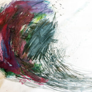
Here is my attempt at this assignment after several goes – very difficult. I chose the sea as my subject as I live near it, I wanted to capture the turbulence and also more calm water as the waves run in to the beach. Very frustrating but feel satisfied with final attempt..
Sheila, AccessArt
February 23, 2015 @ 12:37 pm
Julie, Thank you for sharing this image of the sea – it’s wonderful – so much movement and energy in it and also stunning the way you have experimented with colour – I feel it’s very brave and open. I’m glad that you feel satisfied and I really hope that you will keep going and possibly create a series of these drawings and studies and continue to explore the frequency of mark making and exploration of colour. I feel that if you carry on it will most certainly lead to something and you’ll create a wonderful body of work. I can’t tell what the scale is of this drawing – but would it be worth experimenting with upping the scale? How wonderful to have the sea near by! Bet wishes, Sheila
Julie D
February 23, 2015 @ 3:33 pm
Thank you for your very positive comments Sheila. The scale of the work is A1 but I might try and work on a larger scale as you suggest. I enjoyed using colour but not just blues/greys and I feel encouraged to continue. Many thanks, Julie
Julie D
February 21, 2015 @ 6:13 pm
Here is the analytical drawing…..
Sheila, AccessArt
February 23, 2015 @ 12:43 pm
Julie, I really enjoyed looking at this drawing and the contrast to your drawing of waves. Here you’ve captured a very graphic and linear sense of water – The quality of the lines you’ve created are stunning – i love the rhythm in them and how their density and frequency change, capturing the flow and flux of water moving. Also strong are the shapes which emerge from this drawing – the fact that they too keep changing and undulating. Very inspiring work Julie – really – just keep going! Thanks for sharing and please do post again.
Sheila