By Paula Briggs
Following on from a resource which suggests ways to introduce typography to primary aged children, this resource shares how we built on the idea of creating visual text, and created 3-d visual maps.

We began with a reminder about how we might make our typography more interesting:
- Think about what the text is trying to communicate. How does the place name relate to the place? What kind of place might it be, and how might the sense of place affect the type of typeface you choose to use?
- Make your drawing interesting by keep your mark making varied. Use lines, dots, dashes. Use different weights of pen (thicknesses of nib) to make a variety of weights of line.
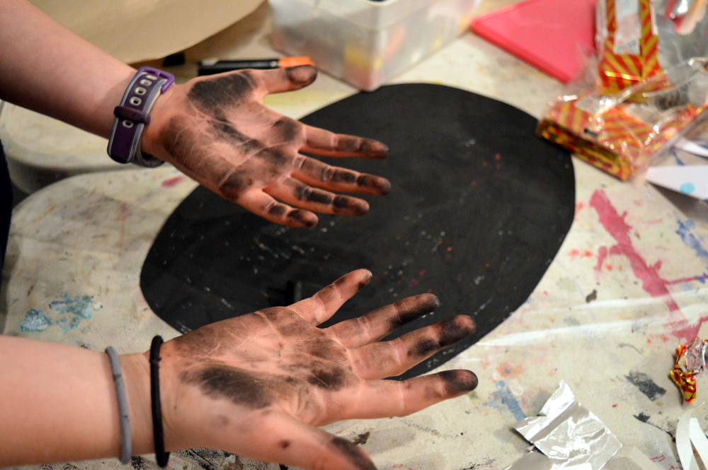
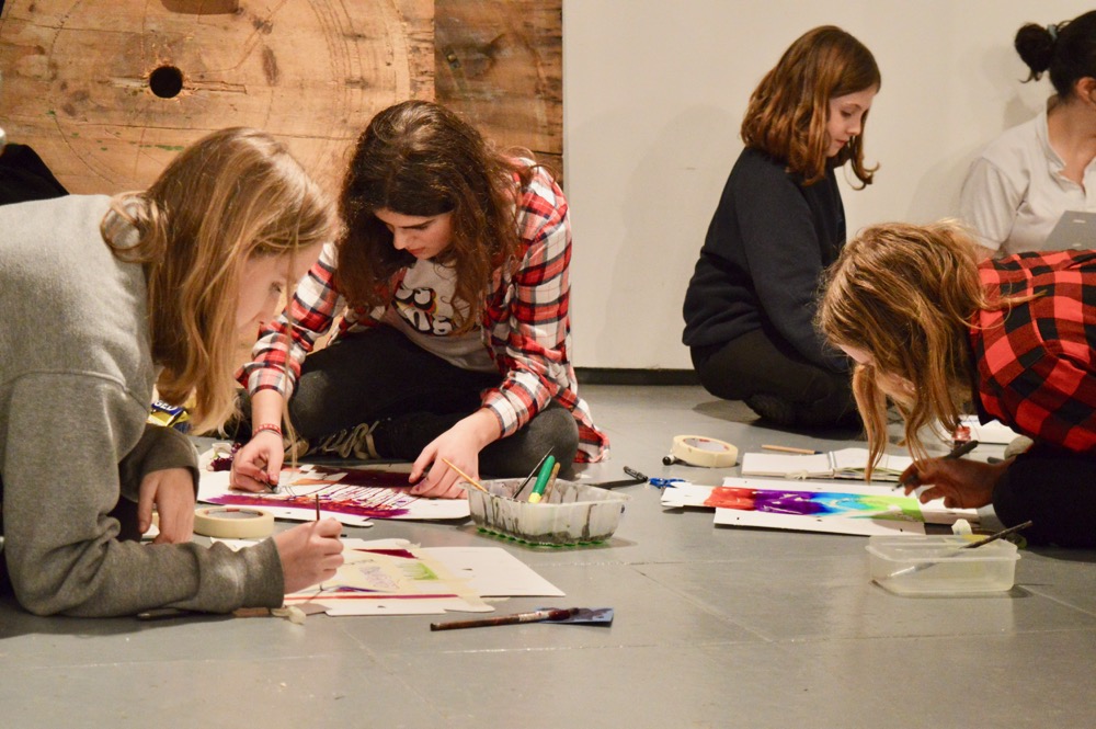
Children were invited to start by marking off areas of their map, for example a cove, beach or forest. Use the shape of the area to inspire the shape of the text, i.e. fill the space with typography! Children worked on A1 sheets of cartridge paper.
To access all content, I would like to join as…
AccessArt is a UK Charity and we believe everyone has the right to be creative. AccessArt provides inspiration to help us all reach our creative potential.
See This Resource Used In Schools…


You May Also Like…
Pathway: Typography and Maps

This is featured in the ‘Typography and Maps’ pathway
Talking Points: What is Typography?

Talking Points: Louise Fili

Talking Points: Chris Kenny

Talking Points: Grayson Perrys ‘Map of Days’

Talking Points: Hogwarts’ Maps

Talking Points: Paula Sher
